Improving UX team efficiency by formalizing the design system
Project Timeline: 12 weeks
My Role: UX Lead
Team: UX Researchers & Product Designers
Tools: Figma
Background
Prior to 2023, SmartAsset’s design efforts lacked a central reference point, with scattered and outdated components causing inefficiencies and friction among stakeholders.
Goal: Establish a centralized design system to streamline workflows and enhance stakeholder buy-in
Approach
Using stakeholder feedback and industry best practices, we developed the design system in eight focus areas:
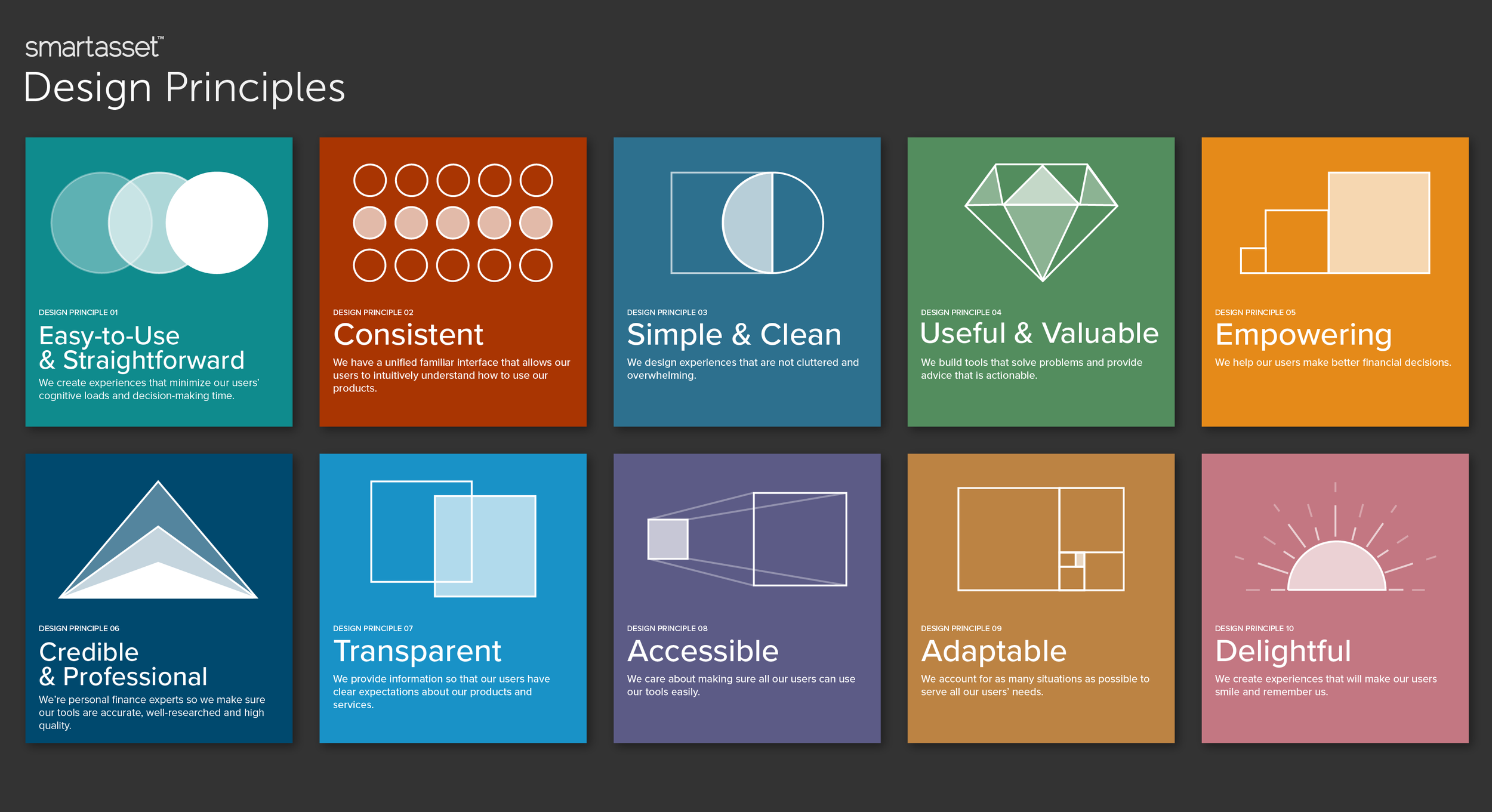
Design Principles: Team-created principles ensuring consistent, user-friendly decisions.
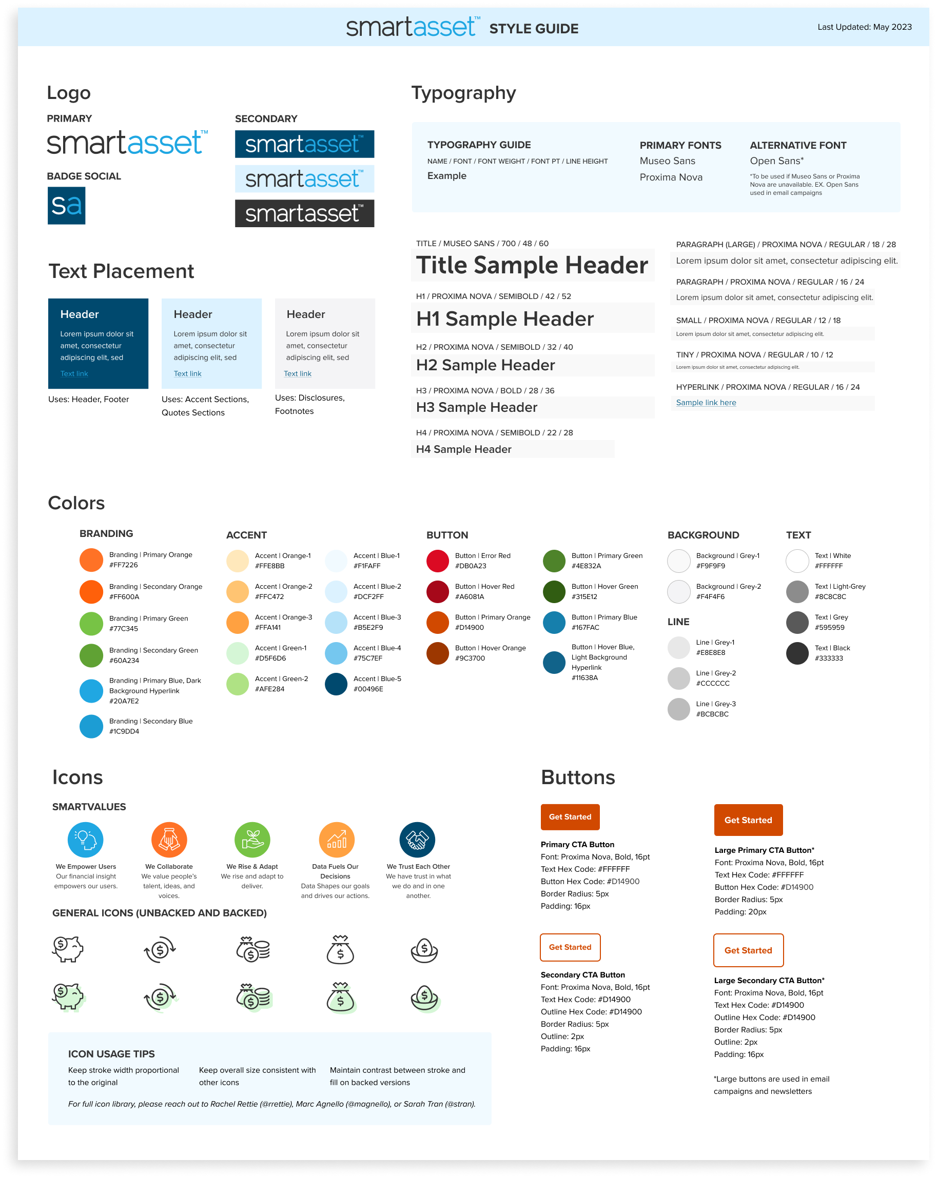
Typography: Standardized typefaces, font sizes, and weights for visual coherence.
Color Palette: Updated for accessibility compliance; improved CTA contrast and added custom iconography.
Iconography: Expanded library to strengthen visual branding.
Components: Modular UI elements (e.g., buttons, forms, navigation menus) for scalable interface building.
Layout Grid: Adopted an 8-point grid for consistent alignment and spacing.
Guidelines: Documentation detailing usage, specifications, and best practices.
Design Assets: Downloadable templates, style guides, and resources for organization-wide access.
Examples of Key Focus Areas:
Design Principles
Color Palette & Iconography
Guidelines & Assets
Outcome
In Q1 2023, the design system launched to enthusiastic reception from Product, Tech, and Marketing teams. It formalized design processes, improved efficiency, and enhanced alignment across teams. Key impacts included:
Faster design workflows with reusable components.
Improved design consistency and accessibility across interfaces.
Learnings
Initial Investment Matters: Developing a design system requires upfront effort but delivers long-term efficiency and consistency gains.
Accessibility is Key: Designing accessible interfaces fosters inclusivity and can lead to significant business benefits.


